White kitchens are officially over – 2026 is all about personality and warmth. These kitchen paint color ideas show you the best shades for walls with white cabinets, oak cabinets, and green cabinets, plus popular Sherwin Williams kitchen colors that work in modern farmhouse, cottage, and rustic spaces. From warm neutral kitchen color palettes to moody blue and forest green ideas, these paint combinations create kitchens that feel current, collected, and completely yours.
Kitchen Paint Colors For Every Style
Okay, controversial take here: white kitchens had their moment, and that moment is OVER.
Don’t get me wrong – white is still beautiful. But the all-white, ultra-minimal, no-personality-allowed kitchen? That’s done. In 2026, kitchens are getting warmer, moodier, and way more interesting. People are choosing rich greens, dusty blues, warm terracottas, and even buttery yellows. They’re embracing color in a way we haven’t seen in over a decade.
Here’s why this shift is happening: kitchens are where we actually live now. They’re not just for cooking – they’re where we work, hang out, do homework, and entertain. We want them to feel personal and inviting, not like a sterile showroom. That means color is back, and it’s back in a big way.
I’m sharing 21 kitchen paint color ideas that cover everything from the best neutral colors for walls with white cabinets to the perfect moody shades for rustic and cottage kitchens. Whether you’re dealing with oak cabinets (I see you!), green cabinets, or starting from scratch, these color palette ideas will help you create a kitchen that feels fresh, warm, and totally 2026.
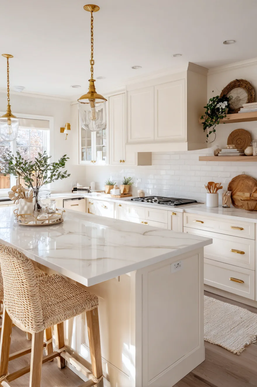
Kitchen Paint Colors With White Cabinets That Feel Fresh
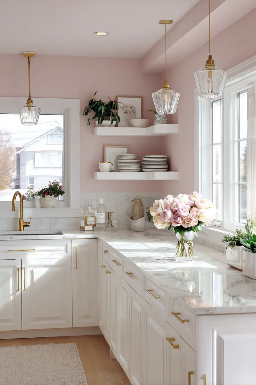
Here’s the thing about white cabinets – they’re super versatile, which means you can go bold or soft on the walls.
Soft pinks are having a moment as the new neutrals, offering a flattering glow and working well with different hard surfaces. I love a dusty blush or soft mauve on kitchen walls with white cabinets. It feels fresh without being overly sweet. Other great options include warm greige, soft sage, or even a muted terracotta. The key is choosing wall colors that add warmth and personality without competing with the crispness of your white cabinetry.
What makes these combinations work is balance. White cabinets provide the clean backdrop, while colored walls bring in the warmth and character that keeps your kitchen from feeling too clinical.
Best Kitchen Paint Colors With Oak Cabinets
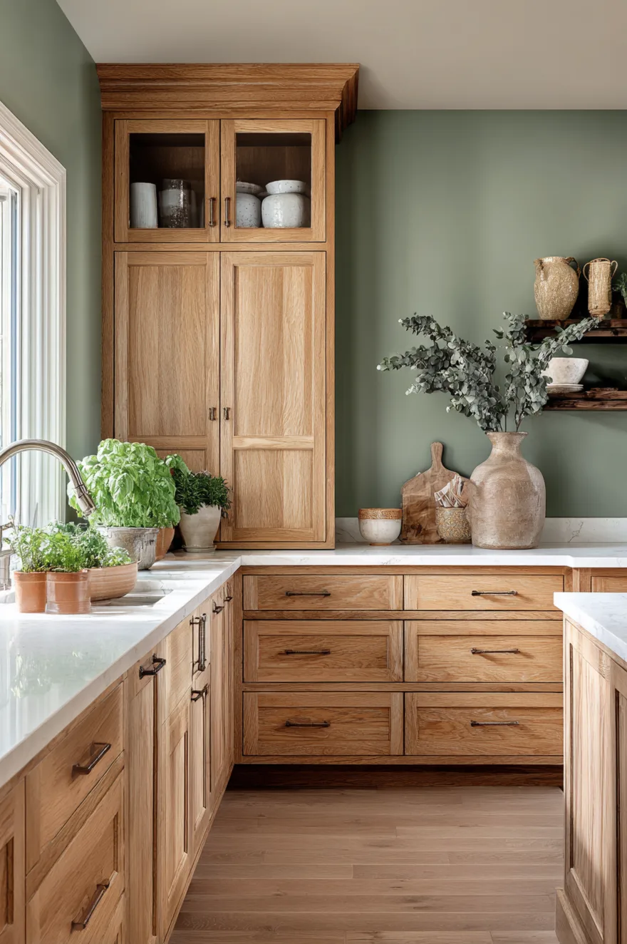
Okay, let’s talk oak cabinets – specifically the honey oak that everyone has and nobody knows how to work with.
Dusty, chalky colors like gray, sage, and mauve look stunning next to oak cabinetry because natural oak is one of the warmest wood species. The trick is avoiding colors that make the orange tones look worse. Skip bright primaries like red, yellow, and cobalt blue – they amplify the yellowy-orange undertones. Instead, go for soft greens (sage, moss, celadon), warm whites, or muted grays with taupe undertones.
The reason these colors work is they complement rather than compete. They tone down the orange without making your oak look even more dated. It’s all about harmony, not contrast.
Popular Sherwin Williams Kitchen Paint Colors
Let me tell you about my favorite Sherwin Williams shades for kitchens right now.
Lemon Chiffon paired with grounding neutrals like Creamy and Universal Khaki delivers personality without overwhelming. I also love Comfort Gray for a blue-green that works with almost any cabinet color, and Accessible Beige for a warm neutral that never fails. For something bolder, Sea Mariner (a deep moody blue) or Dard Hunter Green (a rich forest tone) are total showstoppers.
What I love about Sherwin Williams is their color collections are super curated. You can’t really go wrong if you stick within one of their color families.
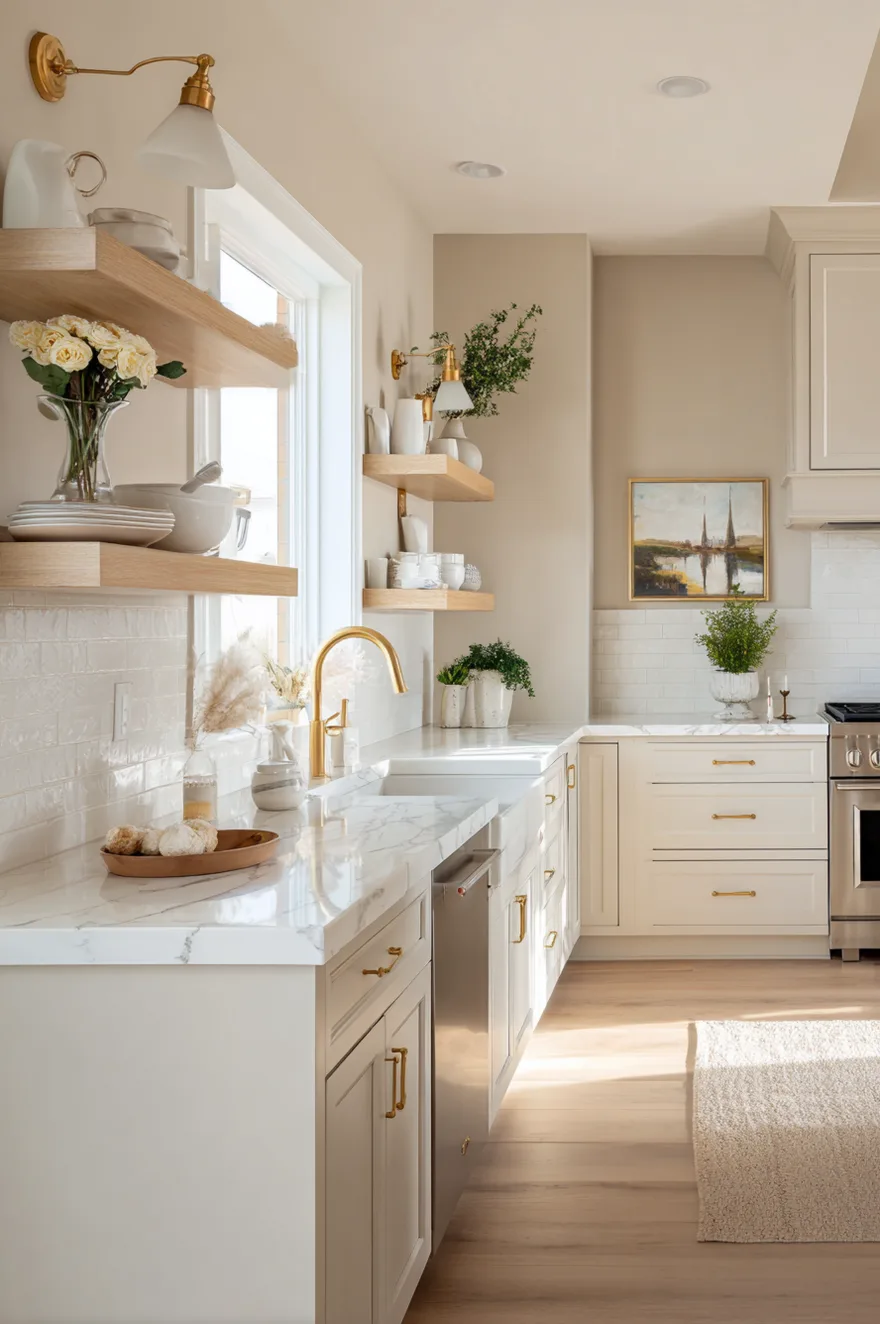
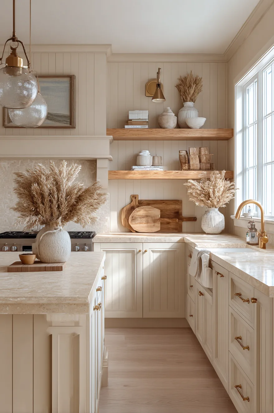
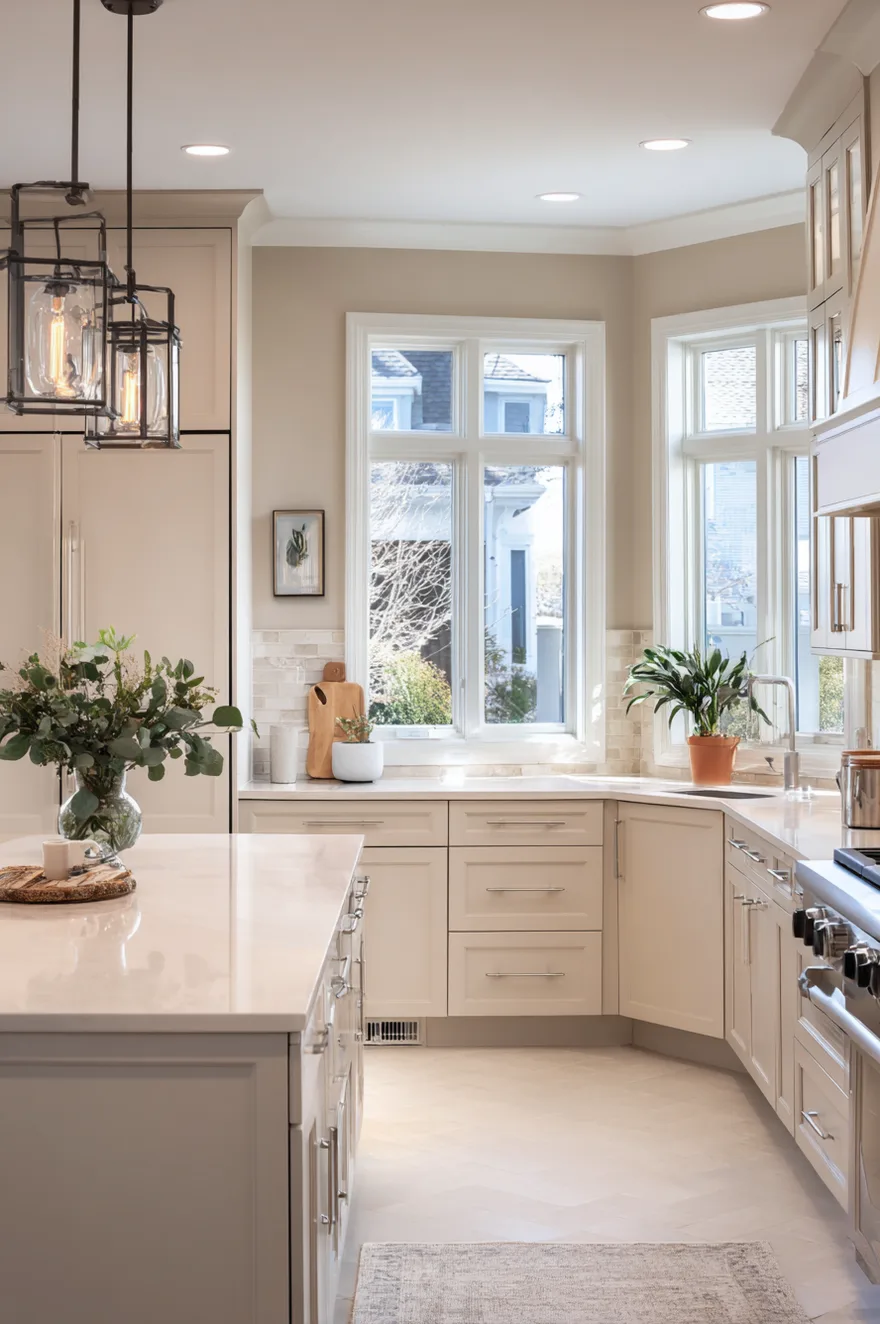
Warm Neutral Kitchen Color Palette Ideas
Here’s what’s happening with neutrals in 2026 – they’re getting WARMER.
Cream kitchens signal a shift from bolder hues, with gentle undramatic colors becoming more popular as people move toward classic creams. Think creamy whites, soft beiges, warm taupes, and mushroom tones. These aren’t your cold gray-beige “greiges” from five years ago – these are warm, inviting, honey-toned neutrals that make your kitchen feel cozy. Pair them with natural wood, brass fixtures, and stone countertops for that organic modern vibe everyone’s craving.
The reason warm neutrals are trending is simple: people are tired of feeling cold in their own homes. We want comfort and coziness, and warm neutrals deliver that instantly.
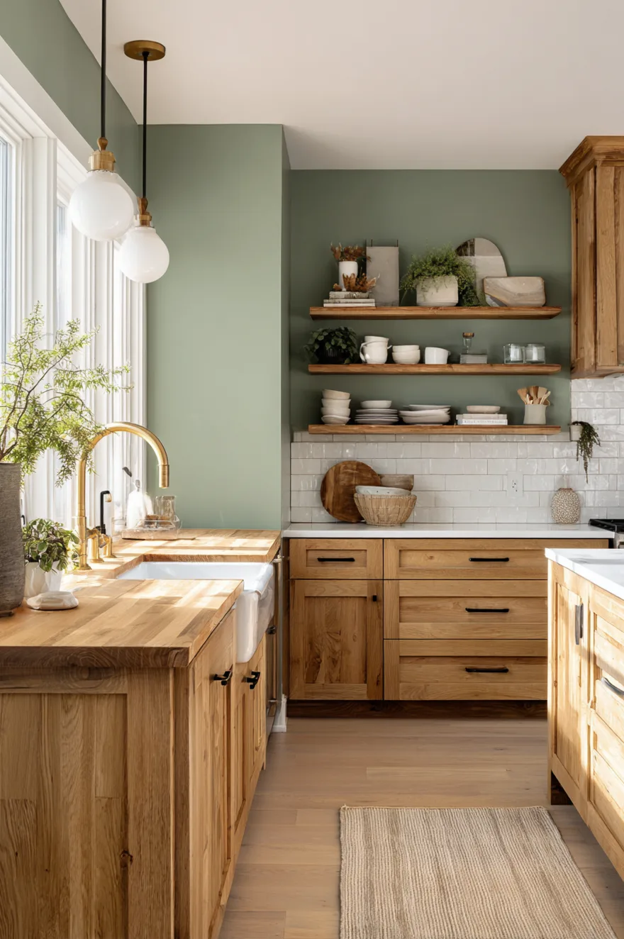
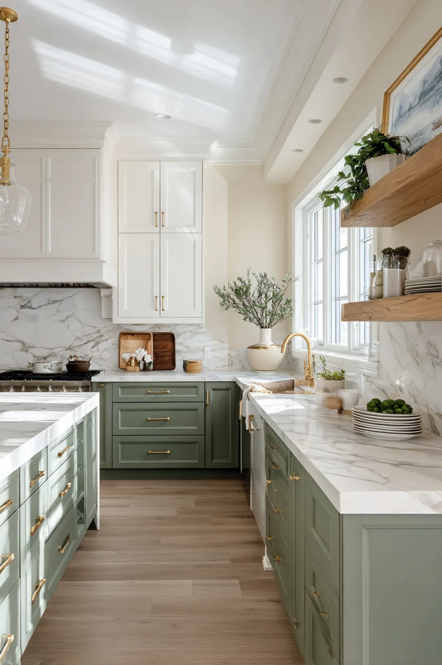
Kitchen Color Palette Ideas Green Cabinets
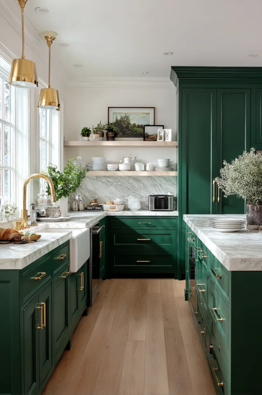
Okay, green cabinets are EVERYWHERE right now, and I’m absolutely here for it.
Grounded greens and muted blues are especially compelling as accents, connecting kitchens to mountain or coastal settings with calm, collected palettes tied to place. Deep forest greens look almost black in low light, like Farrow & Ball’s Studio Green, adding sophistication and depth. For walls, pair green cabinets with warm white, soft cream, or even a complementary sage if your cabinets are darker. The green-on-green look is surprisingly sophisticated when you use different tones.
What makes green cabinets so popular is their connection to nature. They feel grounding and calm but still make a statement.
Modern Farmhouse Kitchen Paint Colors For Walls
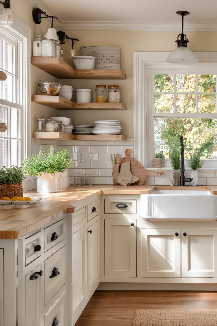
Let me tell you what modern farmhouse is doing in 2026 – it’s getting softer and more collected.
The stark white shiplap moment is over. Now we’re seeing warm creams, soft grays with beige undertones, and muted greens. I love pairing white or cream cabinets with walls in a shade like Sherwin Williams Accessible Beige or Benjamin Moore White Dove. Add in some natural wood open shelving, a farmhouse sink, and you’ve got that modern farmhouse vibe without it feeling overdone or too trendy.
What makes modern farmhouse paint colors work is their warmth and livability. These aren’t Pinterest-perfect showrooms – they’re real kitchens that feel inviting and collected over time.
Kitchen Color Palette Ideas Blue For Coastal Vibes
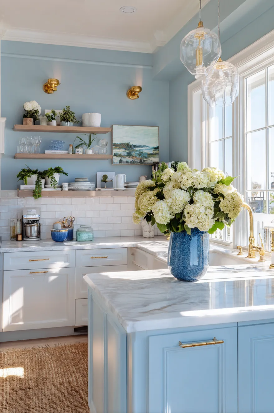
Here’s what I love about blue in kitchens – it brings this calming, almost coastal energy that makes the space feel fresh.
Muted blues are especially compelling as accents, connecting kitchens to coastal settings with calm, collected palettes. I’m talking soft powder blues, dusty denim shades, or even deeper navy tones. Pair blue walls with white cabinets for a classic coastal look, or go bold with navy cabinets and lighter blue-gray walls. Add brass or gold hardware to warm it up and keep it from feeling too cool.
The reason blue kitchen palettes work so well is their versatility. Light blues feel airy and beachy, while deeper blues feel sophisticated and moody.
Rustic Kitchen Paint Colors For Walls
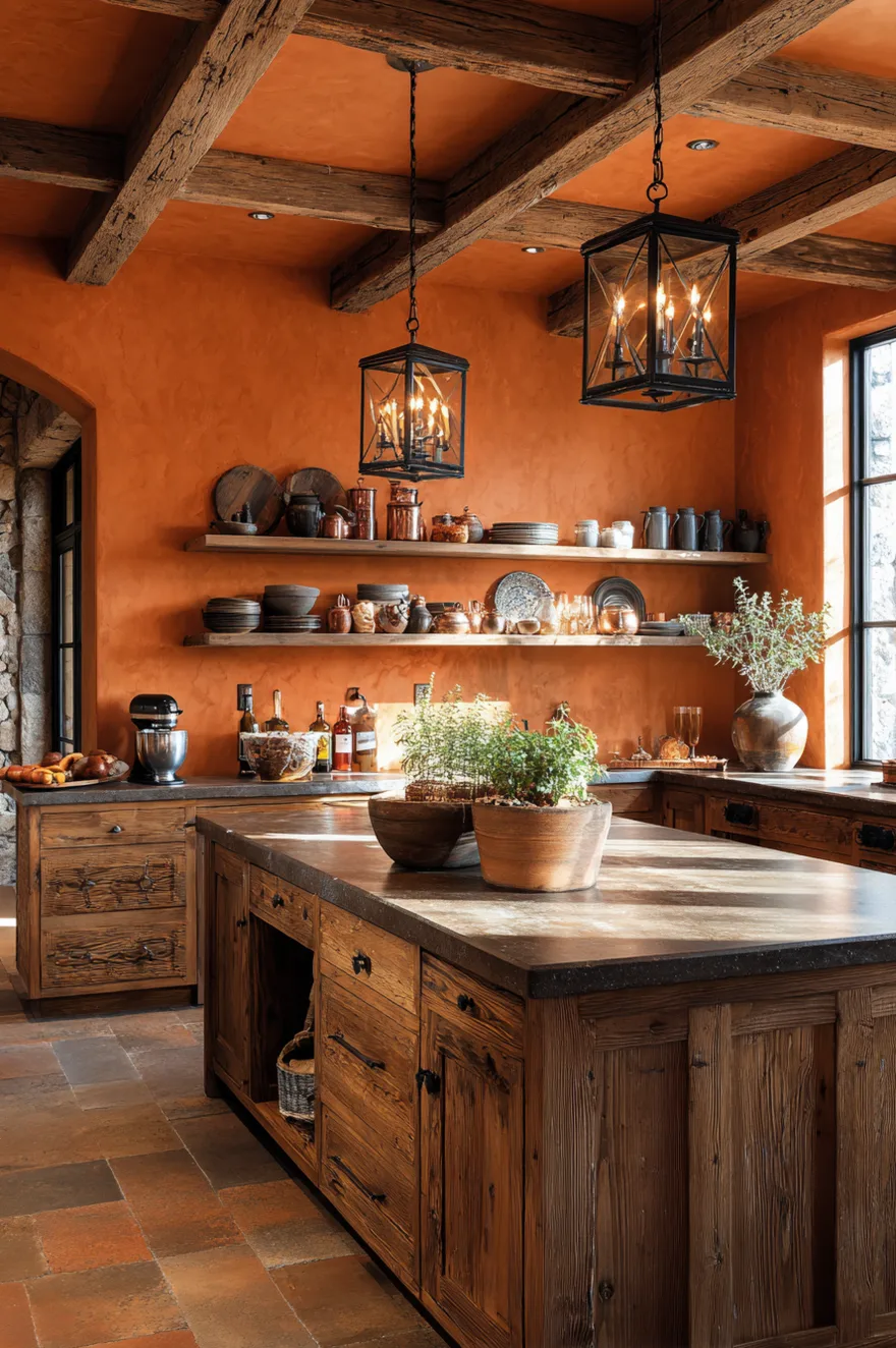
Okay so rustic kitchens need colors that feel earthy and grounded – nothing too bright or modern.
I love warm terracotta, soft clay tones, muted olive greens, and deep barnwood grays for rustic kitchen walls. These work beautifully with natural wood cabinets, exposed beams, and stone or brick accents. The key is choosing colors that look like they came from nature – think desert sunsets, forest floors, and weathered barn wood. Pair them with black iron hardware and natural stone countertops.
What makes rustic paint colors work is their connection to natural materials. They enhance the organic, handcrafted feel that defines rustic style.
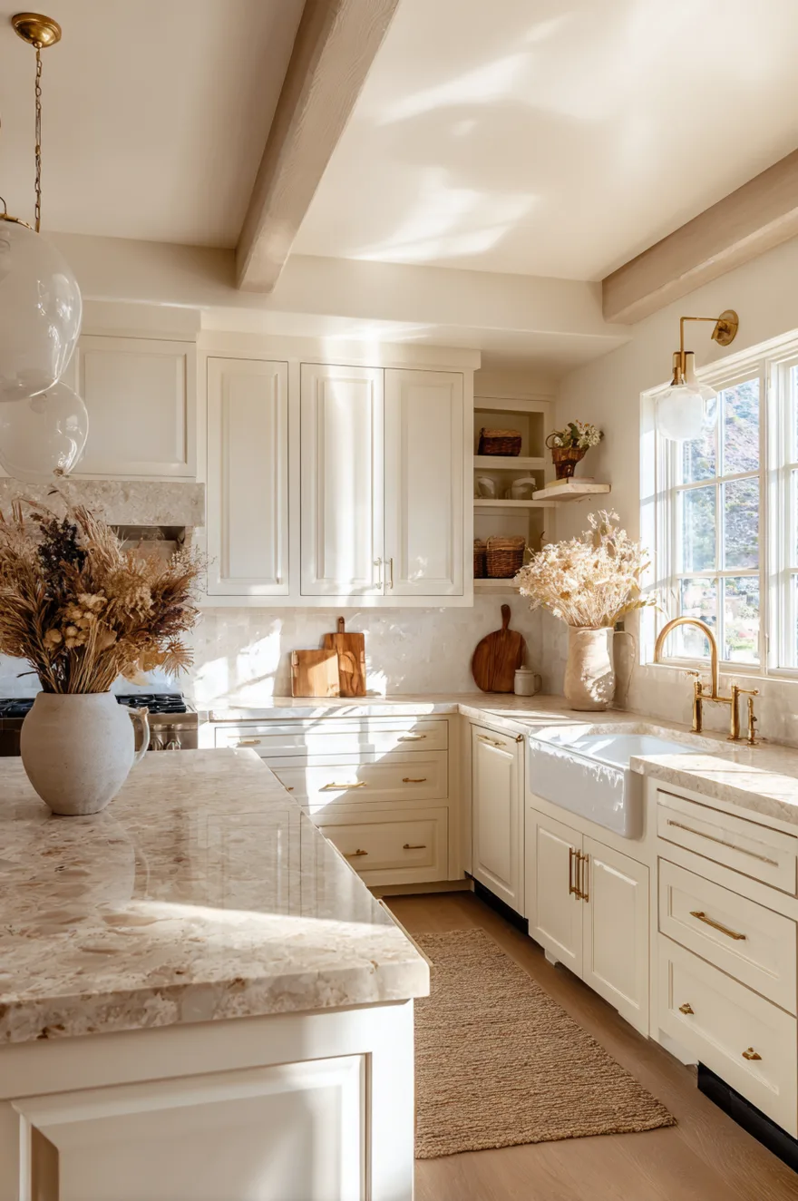
Best White Kitchen Paint Colors That Aren’t Stark
Here’s the thing – not all whites are created equal, and the wrong white can make your kitchen feel like a dentist’s office.
Skip pure bright white and go for warm whites with creamy or yellow undertones. I love Benjamin Moore White Dove, Sherwin Williams Alabaster, or Farrow & Ball Pointing. These whites feel soft and inviting instead of cold and clinical. They work beautifully with white cabinets (yes, white on white can be gorgeous!) or as wall colors with wood or colored cabinetry.
The reason warm whites are better than stark whites is simple: they reflect light beautifully without that harsh, sterile feeling. Your kitchen feels bright but still cozy.
Kitchen Paint Colors With Dark Wood Cabinets
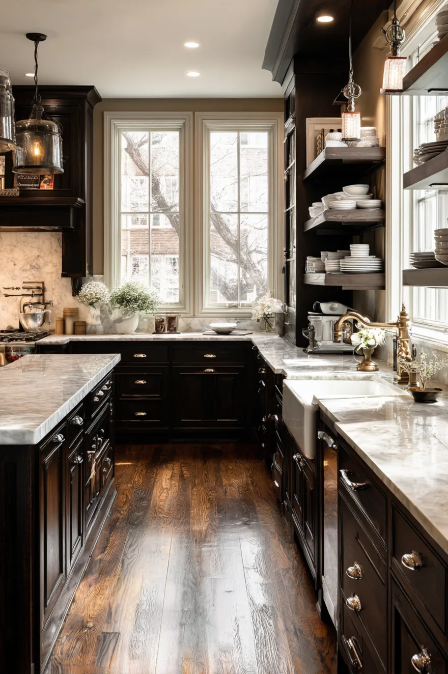
Let me tell you about working with dark wood cabinets – the walls need to be lighter to balance all that richness.
Pair dark walnut or espresso cabinets with warm cream, soft beige, or even a pale sage green on the walls. The lighter walls create contrast and prevent the kitchen from feeling too heavy or dark. I also love a warm white with yellow undertones – it brightens the space while complementing the warm tones in the dark wood.
What makes these combinations work is the balance between dark and light. The dark cabinets add drama and sophistication, while light walls keep the space feeling open and airy.
Cottage Kitchen Paint Colors With Charm
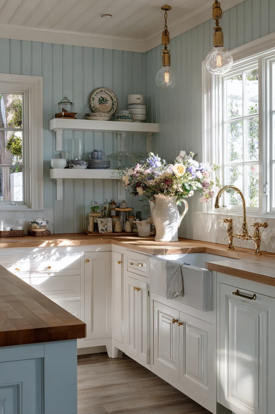
Here’s what cottage kitchens need – colors that feel soft, collected, and a little bit vintage.
I’m talking dusty blues, soft sage greens, warm buttery yellows, and gentle lavender. These aren’t bold statement colors – they’re whisper-soft shades that create a calm, charming atmosphere. Pair them with white or cream cabinets, vintage-style hardware, and open shelving with displayed dishes. Add some floral accents and you’ve got that English cottage vibe everyone loves.
The reason cottage paint colors work is their gentleness. They create a space that feels peaceful and timeless, like it’s been there for generations.
Kitchen Color Palette Ideas Red For Bold Statements
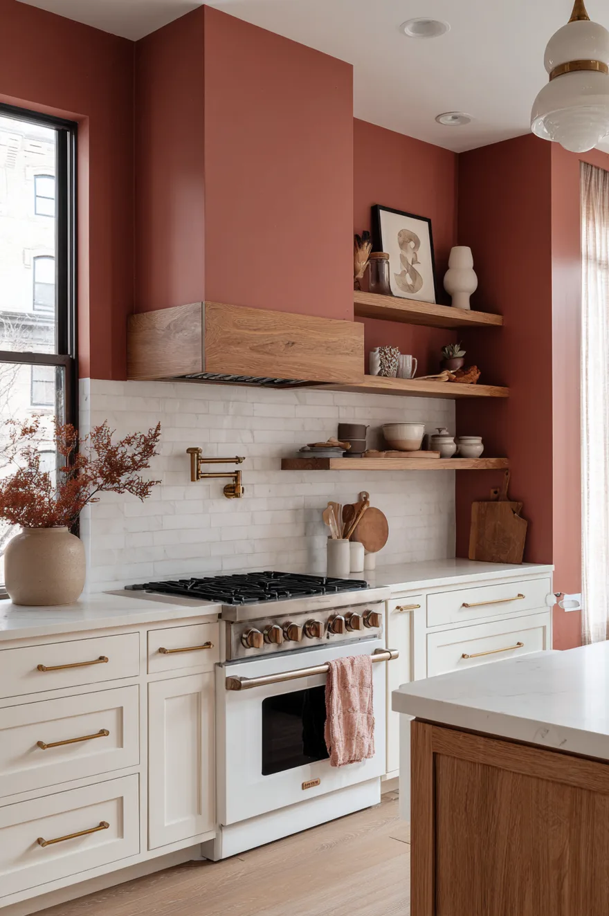
Okay, hear me out on red – it’s not as scary as you think if you do it right.
I’m not talking fire-engine red. I’m talking muted terracotta reds, dusty brick tones, or deep burgundy accents. These work as accent walls in kitchens with white or cream cabinets, or even as a bold cabinet color with neutral walls. Red stimulates appetite (fun fact!), which actually makes it perfect for kitchens. Just use it strategically – one accent wall or lower cabinets in red with upper cabinets in white.
What makes red work in kitchens is its warmth and energy. It creates a focal point and makes the space feel alive and welcoming.
Kitchen Color Palette Ideas Yellow For Cheerful Spaces
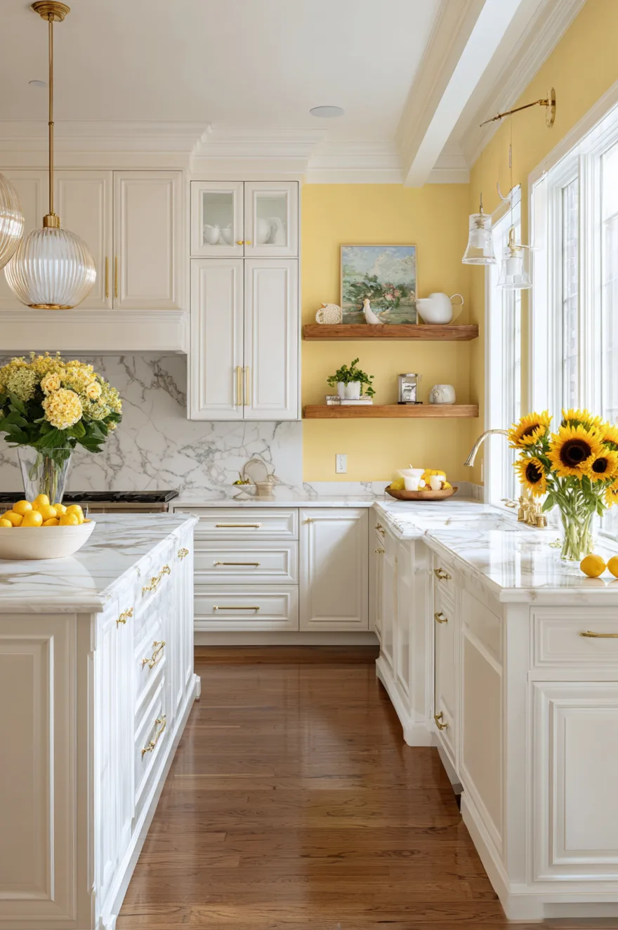
Here’s why I love yellow in kitchens – it’s literally sunshine on your walls, and who doesn’t want that?
Lemon Chiffon paired with grounding neutrals delivers personality without overwhelming. I’m talking soft buttery yellows, warm golden tones, or even a muted mustard. These work beautifully with white cabinets, natural wood, or even navy blue cabinetry for a bold contrast. Yellow makes kitchens feel happy and energizing, perfect for morning coffee. Just avoid neon or overly bright yellows – go for warm, creamy versions instead.
The reason yellow works so well in kitchens is its ability to make the space feel bright and cheerful even on cloudy days. It’s like built-in good vibes.
Kitchen Color Palette Ideas Beige For Timeless Appeal
Let me tell you why beige is having a major comeback – it’s the warm neutral that never goes out of style.
I’m talking soft tans, warm taupes, sandy beiges, and greige blends that lean more beige than gray. These work with literally any cabinet color – white, wood, green, blue, you name it. Beige creates a warm, inviting backdrop that lets your cabinets and accessories shine. Pair with brass or gold fixtures, natural wood accents, and stone countertops for that organic modern look.
What makes beige so popular again is its warmth and versatility. It’s the safe choice that doesn’t feel boring because it creates such a cozy atmosphere.
Kitchen Paint Colors Modern With Moody Tones
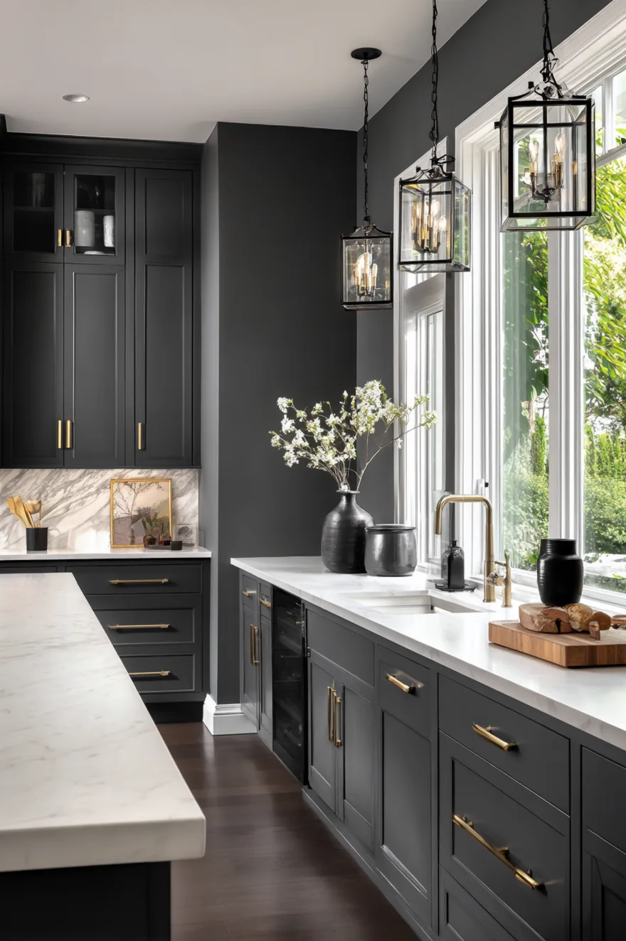
Here’s what modern kitchens are doing in 2026 – they’re going dark and moody in the best way possible.
Think charcoal gray, deep navy, forest green, or even black walls in kitchens with tons of natural light. These dramatic colors work especially well in open-concept spaces where the kitchen needs to feel distinct from the living area. Pair moody walls with white or light wood cabinets, lots of brass or gold accents, and white countertops to keep it from feeling too dark.
The reason moody modern colors work is contrast. The dark walls create drama and sophistication while light cabinets and counters keep the space functional and bright.
Kitchen Color Palette Ideas Wood With Natural Tones
Okay so if you have a lot of natural wood in your kitchen – cabinets, floors, beams – your wall color needs to complement all that warmth.
I love soft greens, warm creams, gentle blues, or even muted terracotta with wood kitchens. These colors enhance the natural beauty of the wood without competing with it. The key is choosing colors with warm or neutral undertones that harmonize with the wood tones you already have. Avoid cool grays or stark whites that will make the wood look orange or yellow.
What makes these combinations work is harmony. The wall color and wood tones work together to create a cohesive, natural-feeling space.
Kitchen Paint Colors Ideas For Walls With Open Shelving
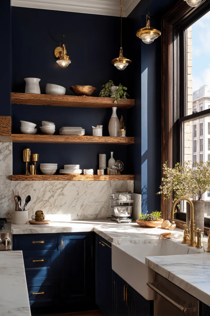
Here’s what you need to know if you have open shelving – your wall color becomes part of the display.
Bold or dark wall colors look amazing behind open shelves because they create contrast and make your dishes and accessories pop. I love deep navy, forest green, terracotta, or even black behind white dishes. If you prefer something softer, try a warm cream or dusty blue. The wall color should complement what you’re displaying – white dishes look great against any color, while colorful dishes need a neutral backdrop.
The reason wall color matters so much with open shelving is visibility. The wall becomes part of the design, not just a background.
Kitchen Color Palette Ideas Warm For Inviting Spaces
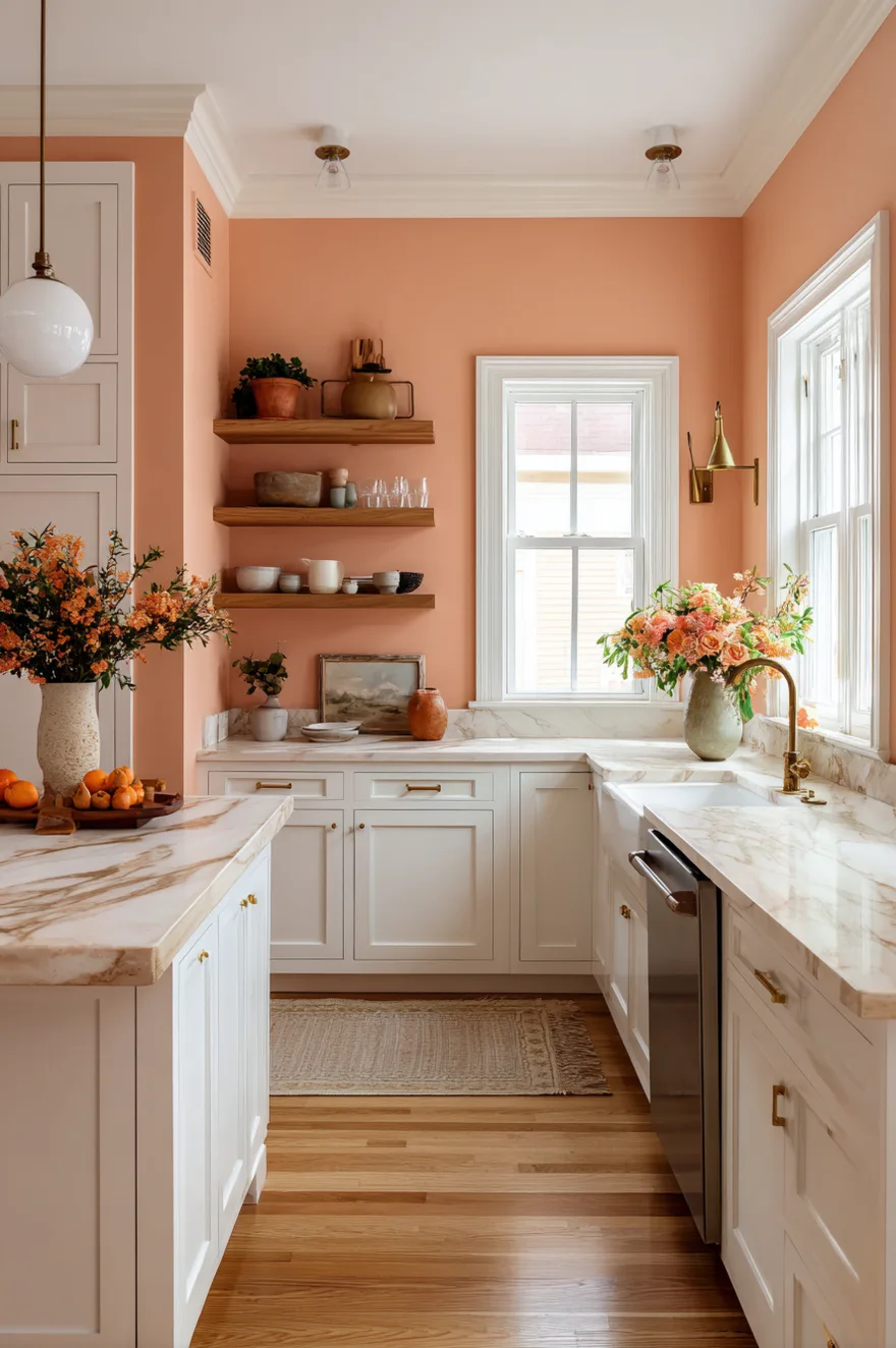
Let me tell you about creating a warm kitchen – it’s all about choosing colors with yellow, red, or orange undertones.
Think warm whites, creamy beiges, peachy pinks, terracottas, golden yellows, and rust oranges. These colors create a cozy, inviting atmosphere that makes your kitchen feel like the heart of the home. Pair them with natural wood, brass fixtures, and warm-toned stone countertops. Avoid anything with blue or gray undertones if you want maximum warmth.
What makes warm color palettes so appealing is their ability to make spaces feel welcoming and comfortable. They create kitchens where people actually want to hang out.
Kitchen Paint Colors Neutral That Never Fail
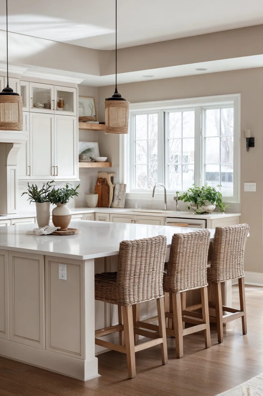
Here’s the truth about neutrals – they’re called neutrals for a reason. They work with everything and never go out of style.
My go-to neutrals for kitchens are warm white, soft beige, greige (more beige than gray!), and gentle taupe. These create a calm, sophisticated backdrop that lets your cabinets, countertops, and accessories be the stars. Neutrals work with any cabinet color, any style, and any budget. They’re the safe choice that doesn’t feel boring when you add texture through natural wood, interesting hardware, and styled accessories.
The reason neutrals never fail is their flexibility. You can change everything else in your kitchen and the walls will still work perfectly.
Kitchen Color Palette Ideas Indian With Rich Tones
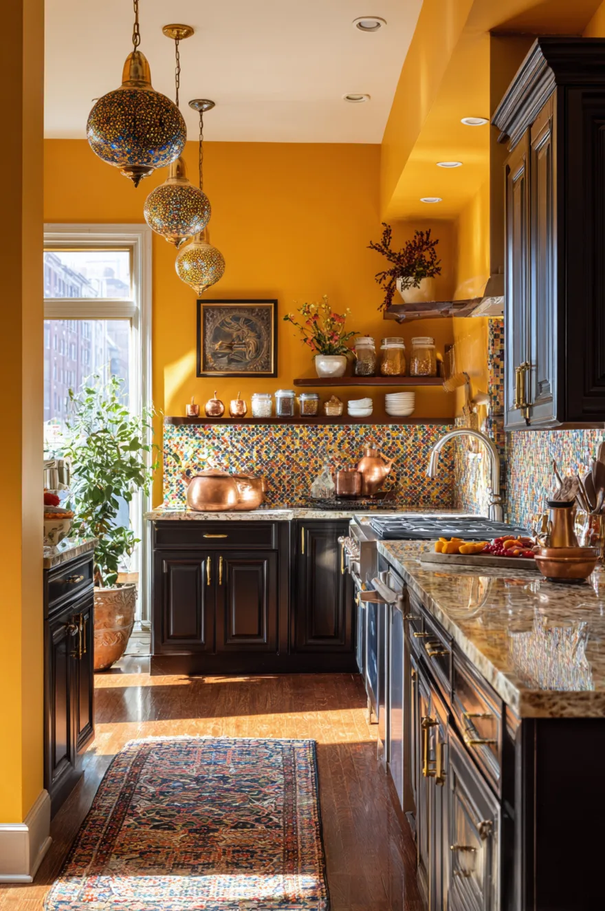
Okay so Indian-inspired kitchens are all about rich, saturated colors that feel vibrant and warm.
Think deep saffron yellows, rich terracotta reds, warm curry oranges, and earthy browns. These bold colors work beautifully with dark wood cabinets or as accent walls in kitchens with lighter cabinetry. Add brass or copper fixtures, colorful tile backsplashes, and open shelving with displayed spices and copper pots. The key is embracing warmth and richness – these aren’t subtle colors, and that’s exactly what makes them special.
What makes Indian color palettes so beautiful is their celebration of warmth and vibrancy. They create kitchens that feel alive, welcoming, and full of personality.
Two-Tone Kitchen Paint Ideas For Visual Interest
Here’s a fun trend – using two different colors in one kitchen to create zones and add visual interest.
I love doing darker lower cabinets with lighter uppers, or painting one accent wall a bold color while keeping the rest neutral. You could also do different colors in the cooking zone versus the dining area in an open kitchen. The key is choosing colors that complement each other – like navy and white, forest green and cream, or charcoal and soft beige.
What makes two-tone kitchens work is the visual interest they create. They add depth and personality without requiring you to commit to one bold choice everywhere.
Kitchen Paint Colors That Increase Home Value
Let me give you the real estate truth – certain colors actually help your home sell better and faster.
Neutral colors like warm white, soft beige, and light gray are the safest bets for resale value. They appeal to the widest range of buyers and let people imagine their own style in the space. That said, a well-done accent wall in a trendy color like sage green or navy can actually increase appeal – it shows the home is updated and current without being too personal.
The reason neutrals work for resale is simple: they don’t offend anyone. Buyers can see themselves living there, which is exactly what you want.
Last thoughts
So there you have it – 21 kitchen paint color ideas that prove white isn’t the only option! Whether you’re working with oak cabinets, white cabinets, or green cabinets, there’s a color palette here that’ll make your kitchen feel fresh, personal, and totally 2026.
The main takeaway? Don’t be scared of color. Choose warm neutrals if you want safe and timeless, go for moody blues or greens if you want drama, or embrace cheerful yellows and pinks if you want energy.
And remember: your kitchen should reflect YOUR personality, not just follow trends.
With love,
Liv